Refreshing the image and improving the usability of the Main Sanitary Inspectorate website

Back

Client

The Main Sanitary Inspectorate is a state institution reporting to the minister for health. Its task is to supervise the sanitary and hygienic conditions of the country and to create activities aimed at the well-being and public health of citizens. The institution's mission is to minimize the effects of events adversely affecting Poles' lives by informing, activating and educating. The group of recipients of the site are both private individuals, branches and entrepreneurs.

Challenge

Due to the enormity of materials published on the GIS website, dedicated to a very diverse target group, the Institution needed help in facilitating users to reach the information sought. It was also essential to organize the content available on the site, as well as refresh its design and adapt it to the expectations of the modern market.

Based on the results of research and analysis, we proposed a new information architecture (structure and navigation), which was used to create mockups and then design.

Solution

Division and appropriate segmentation of content available on the site

Due to the very diverse target group and extensive goals that they can achieve through the website (e.g. searching for information on food labeling requirements, vaccinations required to travel to a given country, list of bathing areas, requirements for sanitary conditions of nurseries, ways to fight with afterburners, employer health and safety requirements, supplements and modified food, or even corpse transport), the main challenge was to rightly divide the content available on the website. It helped us to identify the person and their main behavioural paths. As a result, we proposed specific thematic blocks to which the content was appropriately assigned (articles, information, legal acts, etc.). The next step was their proper presentation.

Intuitive navigation and information architecture

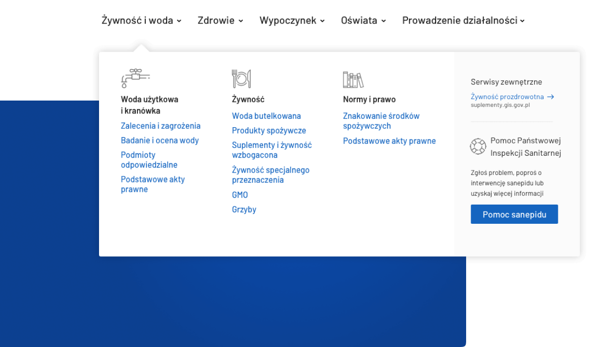
Research has shown that, depending on the context, users search for content in two ways: they look for information on a given topic (e.g. health, water, food) or browse content adapted to the role they play (e.g. teacher, school head, owner of a hair salon) Therefore, we decided to categorize content at the same time based on the topic sought by the users (main menu) and the role played (tiles).

When creating a new information architecture, we put a lot of emphasis on moving away from the official language and adjusting communication to the language of the target group.

Quick access to the information most sought after

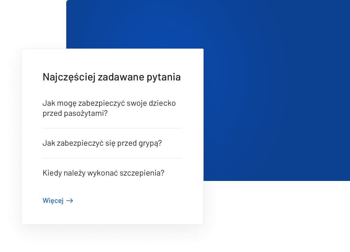
To relieve GIS employees handling telephone inquiries of clients, we decided to transfer the information function to the site. We've put the content that most interested callers in the "Frequently asked questions" sections.

Practical materials to download

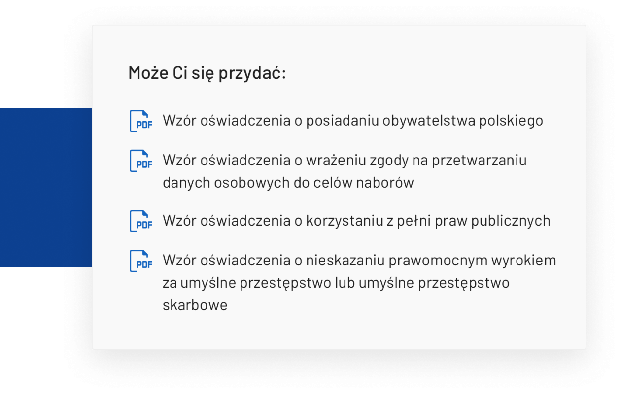
One of the website's target groups are entrepreneurs who are required to submit various types of documents to the Chief Sanitary Inspectorate. Access to current magazine designs, which we decided to show contextually, was particularly important for them. The aim was to reduce the likelihood of making mistakes in applications submitted to the Institution, and thus - to shorten the duration of the procedure.

Warnings for citizens

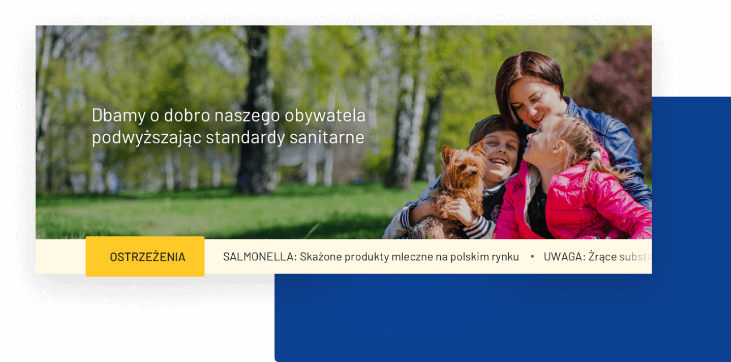
The task of the Chief Sanitary Inspectorate is to minimize the effects of events adversely affecting the lives of citizens. Keeping up to date information on threats was extremely important. So we decided to add a section with the most critical messages on the main page and display it correctly.

The ability to quickly find help

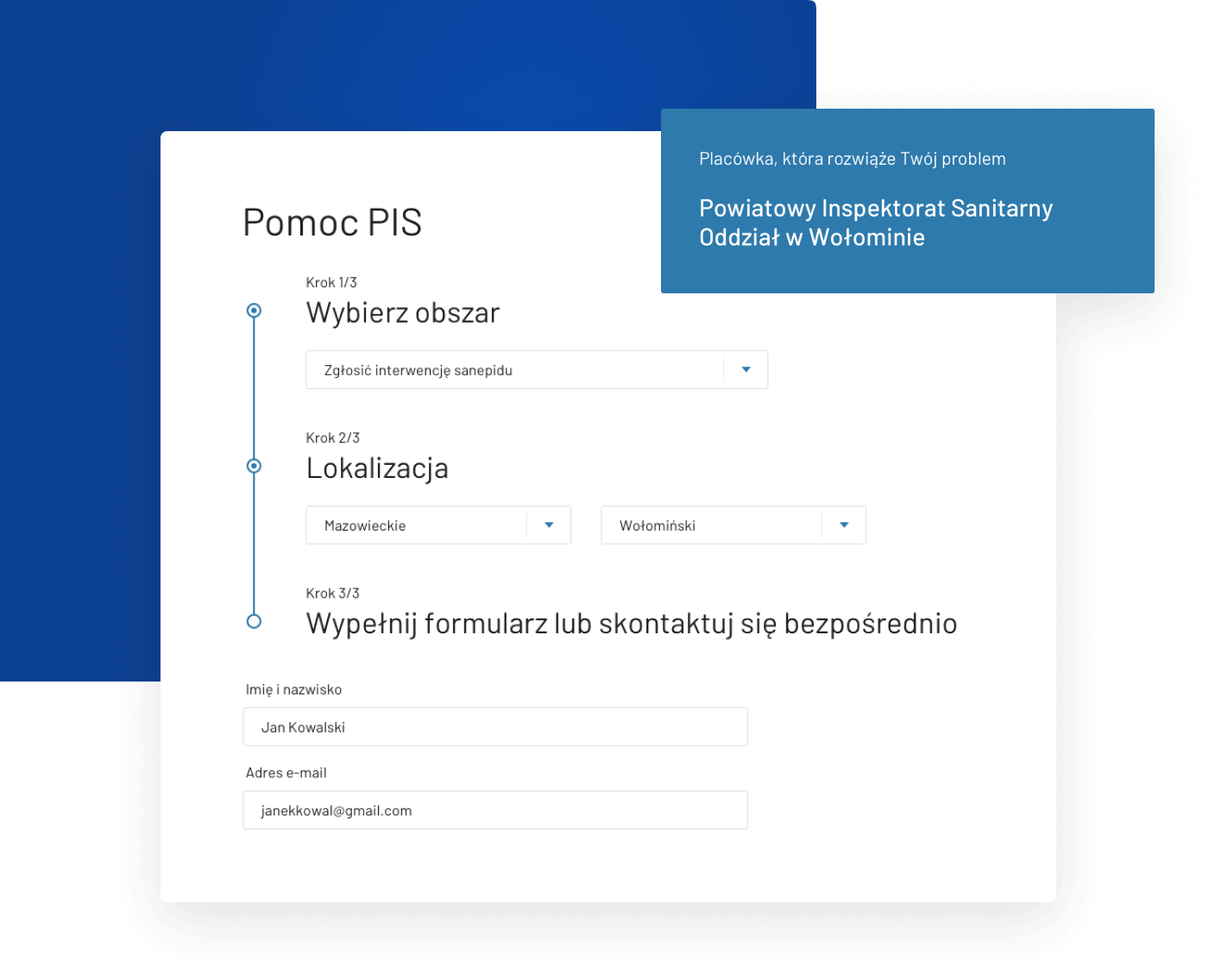
The State Sanitary Inspection handles citizens' queries and problems through specially dedicated facilities. Users had a problem determining which institution should go to which issue. The interactive form allows you to reach the facility responsible for the problem quickly.

Results

60% lower
bounce rate
2x more
returning users
2x more
website traffic

Creating a new, intuitive website architecture adapted to the needs of the target group

Making it easier for users to reach the information they are looking for

Adaptation of communication to a given target group

Creating a new, light design

Exposing the role of the State Sanitary Inspection and building a friendly image

Helping to quickly find information about the appropriate facility

— Główny Inspektorat Sanitarny

Let’s talk about your project

Email us at office@overlap.studio or send us your contact details so we can reach you.

Thank you! We received Your submission and get will back to you shortly!
Oops! Something went wrong while submitting the form.

No worries. We will not share your contact details. Just check our privacy policy.